calgary+buildings+downtown

MEDIA INQUIRIES ONLY

Phone #: 403-880-7040

Contact
calgay+skyline+downtown

Brand Guide

DOWNLOAD FULL BRAND GUIDE


Logos

The Calgary Economic Development logo includes the Calgary wordmark, Be Part of the Energy tagline and Economic Development sub-brand. Our tagline has been trademarked and the trademark symbol must always appear with the tagline. Under no circumstance should any component of the wordmark be redrawn, modified or altered in any way. Reproduction of the wordmark must be executed using the approved electronic files.


CALGARY ECONOMIC DEVELOPMENT LOGO

All collateral and digital assets belonging to Calgary Economic Development should have Calgary Economic Development’s logo present. Some examples include, annual reports, website properties, and social media channels. Prior to design it’s important to work with the client in determining the collateral’s purpose and primary audience. This information will help you determine whether the final product should feature Calgary Economic Development’s logo or Calgary only logo.

Download Calgary Economic Development logo files 


CALGARY ONLY LOGO

The Calgary only logo should be used on all collateral and assets that market Calgary abroad. This can include PowerPoint presentations, sector-based flat sheets, and out-of-market campaigns. While the audience is similar to Calgary Economic Development’s they don’t need to know Calgary Economic Development, and therefore the logo does not need the Economic Development sub-brand.

Download Calgary Only logo files


COLOUR VARIATIONS

The full colour version and knockout colour version of both logos can be used. However, the full colour version is the preferred logo of choice and should be used whenever possible. The knockout colour version should only be used when the logo is presented on a dark coloured background, specifically in Calgary’s red colour. In cases where only one colour printing is the only option available, proceed with using the knockout version of the logo on a black box background.


LOGO LAYOUT WITH OTHER PARTNERS

In cases where Calgary Economic Development is working in collaboration with a partner, both logos should appear equal in size and appear side by side with the appropriate clear space available between both logos. It is advised that both logos are presented in full colour. However, if the design doesn’t allow for it, knockout version on a red background is best. Note: Exceptions apply especially in cases when other partners’ brand standards vary greatly from Calgary Economic Development’s. (E.g. when partners colours conflict with Calgary Economic Development's red. In this case, use black instead).


Brand Colours

When it comes to our brand, the colours we use are as important as the words and visuals we choose. Use the primary colour palette for floods of colour and major graphics. The secondary colour palette can be used for variation, or in combination with the primary colour. These colours should be used sparingly and not dominate the design. Further expansion of Calgary Economic Development’s colour palette. These colours should be used when no other colour options are available.


PRIMARY


Digital: RGB

Digital: HEX

Print: Pantone

Print: CMYK

Red

 237 /28 / 41

#ED1C29

PMS 185 C

0 / 99 / 93 / 0 

Black

0 / 0 / 0

#000000

PMS Black 6 C

75 / 68 / 67 / 90

White

255 / 255 / 255

#FFFFFF

N/A

0 / 0 / 0 / 0

Cool Grey

84 / 88 / 96

#54565A

PMS Cool Grey 11 

63 / 52 / 44 / 33


SECONDARY
  Digital: RGB Digital: HEX Print: Pantone Print: CMYK
Turquoise 0 / 175 / 206 #00ABC8 PMS 3125 C 89 / 0 / 19 / 0
Sky Blue 120 / 214 / 236 #82D2E8 

PMS 2225 C 

45 / 0 / 7 / 0 
Dark Blue 0 / 62 / 82  #004158  PMS 548 C  100 / 08 / 11 / 14 
Indigo 56 / 94 / 164  #385EA4  PMS 7684  85 / 62 / 0 / 0 


TERTIARY
  Digital: RGB Digital: HEX Print: Pantone Print: CMYK
Yellow 252 / 229 / 0 #FCE200 PMS 102 C 0 / 0 / 100 / 0
Teal 92 / 185 /187 #5CB8B2 PMS 7272 61 / 0 / 28 /0


Typography

Calgary Economic Development's main identity is set using a combination of Proxima Nova Extra Condensed and Myriad Pro typeface weights.


PRIMARY DISPLAY HEADLINE TYPEFACE
Proxima Nova Extra Condensed Extra Bold Proxima Nova Extra Condensed Regular
Proxima Nova Extra Condensed Extra Bold Italic Proxima Nova Extra Condensed Regular Italic


ALTERNATIVE DISPLAY HEADLINE TYPEFACE

*Only to be used in cases where Proxima Nova Extra Condensed is not available.

Franklin Gothic Demi Condensed Franklin Gothic Demi Condensed Italic
Franklin Gothic Demi Condensed Bold Franklin Gothic Demi Condensed Italic


PRIMARY BODY COPY TYPEFACE
Myriad Pro Light Myriad Pro Light Italic
Myriad Pro Bold Myriad Pro Bold Italic
Myriad Pro Regular Myriad Pro Regular Italic
Myriad Pro Black Myriad Pro Black Italic
Myriad Pro Semibold Myriad Pro Semibold Italic 


ALTERNATIVE BODY COPY TYPEFACE

*Only to be used in cases where Myriad Pro is not available.

Verdana Verdana Italic
Verdana Bold Verdana Bold Italic


Media Gallery

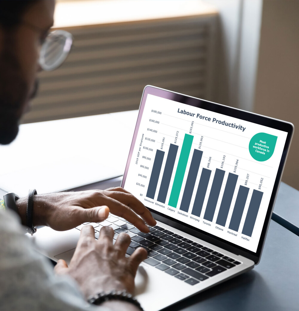
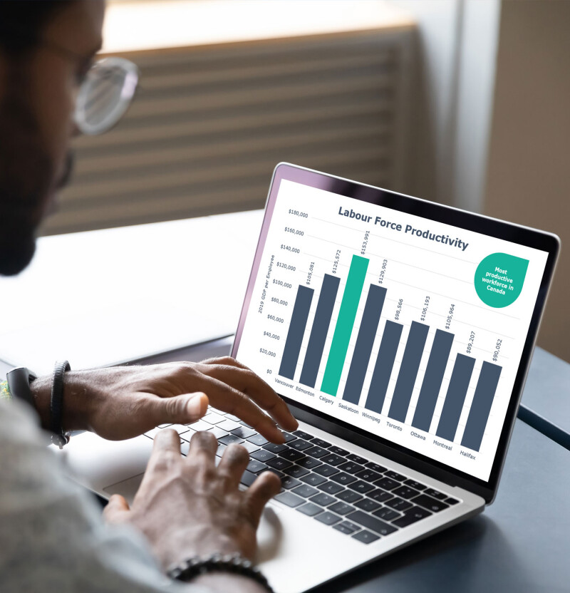
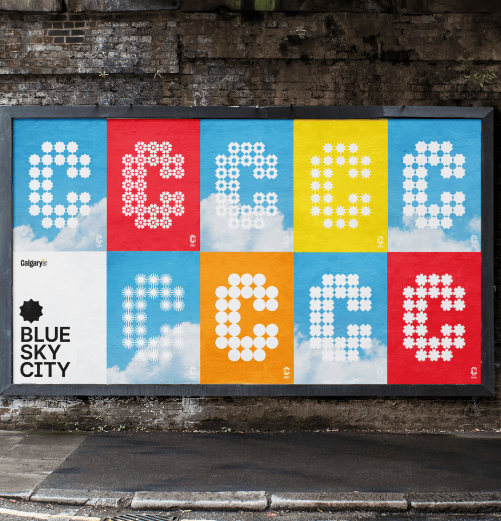
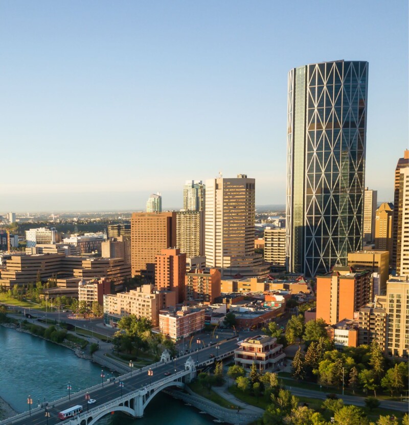
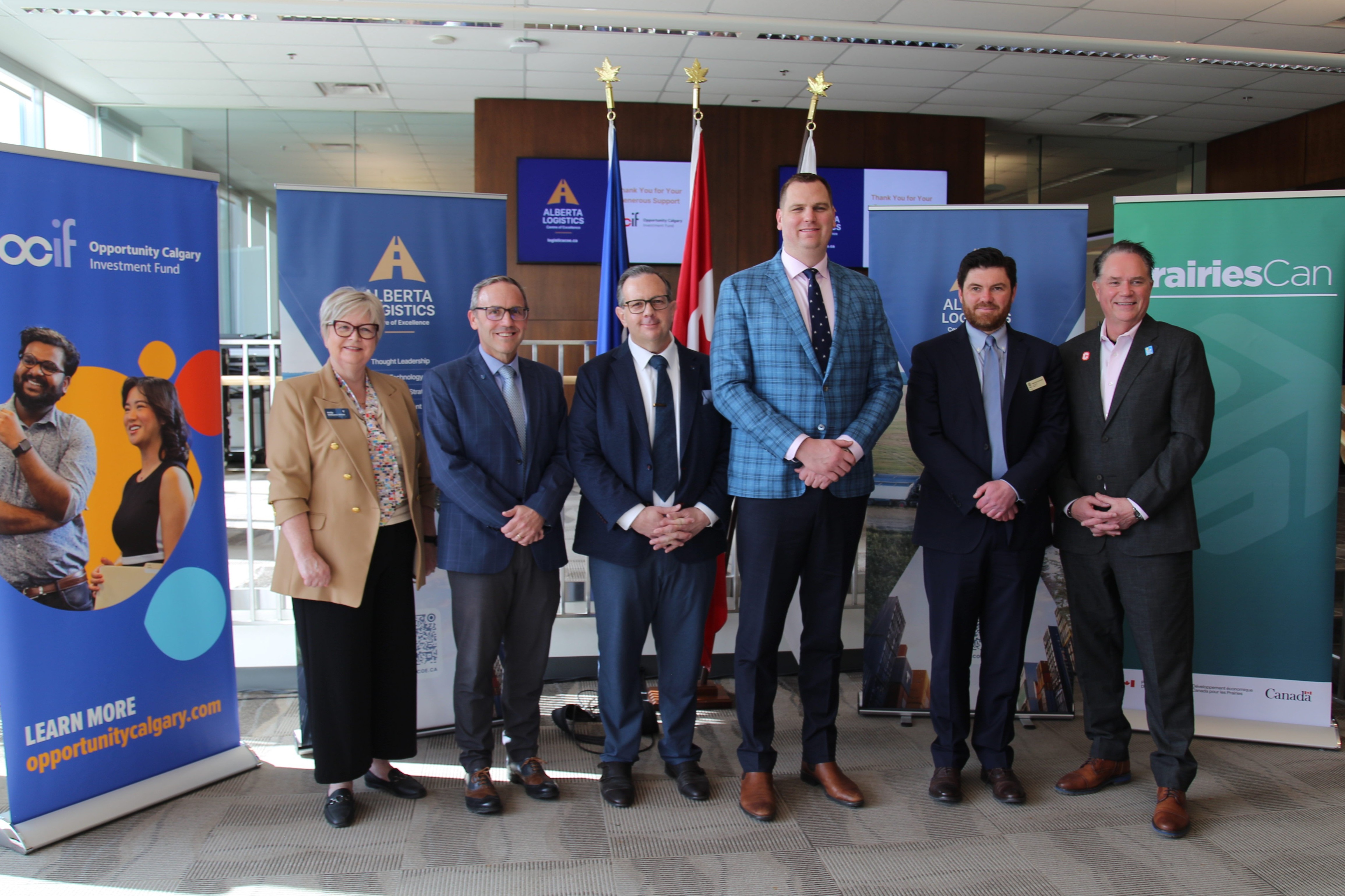
Painting Calgary in modern and unexpected ways one visual at a time. The visuals we choose speak to the momentum and vibrancy of Calgary. The main pillars of our visual assets are: architecture and landscapes, people, and technology 


Have questions?

Contact us

Subscribe to Our Mailing List

Yes
No